A important aspect of understanding inorganic contaminant mobility in drinking water systems is identifying the solid phases that exist on the interior surfaces of pipes. This is frequently done with X-ray diffraction (XRD), and I am often preparing figures to communicate XRD data. This post provides an example workflow for displaying XRD data and automatically labelling the peaks so that readers can easily attribute them to the appropriate solid phases. It makes use of the peak detection function peak_maxima() in my field-flow fractionation data analysis package fffprocessr.
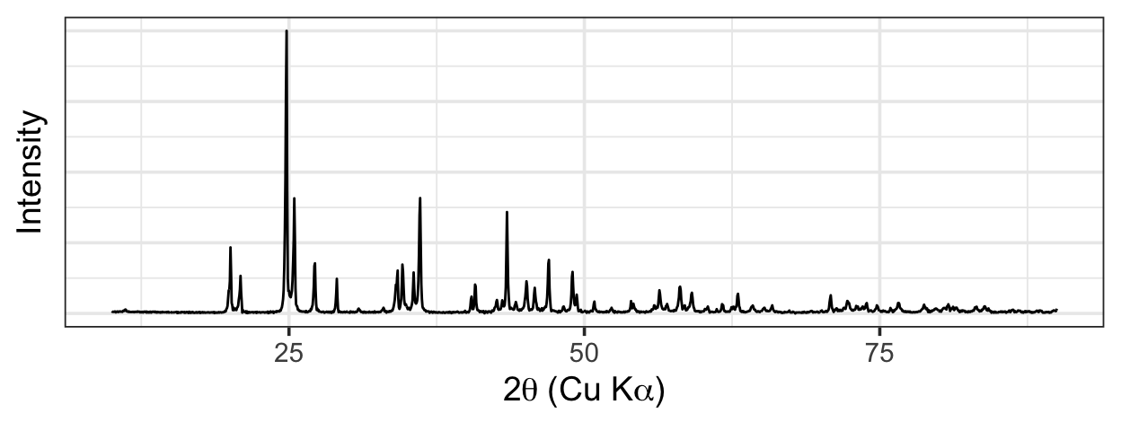
For this example, we’ll use an XRD pattern representing a mixed lead carbonate phase containing cerussite (PbCO3) and hydrocerussite (Pb3(CO3)2(OH)2). Here are the data, along with a couple of quick plotting functions to avoid repetition later on:
label_axes <- function(...) {
  labs(
    x = expression("2"*theta~"(Cu K"*alpha*")"),
    y = "Intensity",
    ...
  )
}

custom_colour_scale <- function(n = 3, ...) {
  scale_colour_manual(values = wesanderson::wes_palette("Zissou1", n)[c(1, n)])
}

data %>%
  ggplot(aes(two_theta, intensity)) +
  geom_line() +
  label_axes()
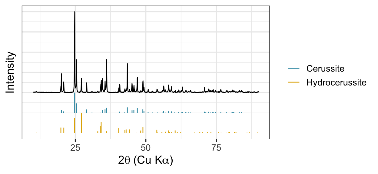
First we need a quick and dirty method of determining the order in which phases should appear in the plot—interpretation is easiest when the standard that matches the data best appears closest to it.
xrd_corr <- function(run, standard) {
  list(
      sample = run,
      std = standard
    ) %>%
    bind_rows(.id = "type") %>%
    pivot_wider(id_cols = two_theta, names_from = type, values_from = intensity) %>%
    group_by(two_theta = round(two_theta)) %>%
    summarize(sample = median(sample, na.rm = TRUE), std = median(std, na.rm = TRUE)) %>%
    ungroup() %>%
    with(cor(sample, std, use = "complete", method = "pearson"))
}

importance <- stds %>%
  distinct(phase) %>%
  pull(phase) %>%
  set_names() %>%
  map_dfc(
    ~ xrd_corr(
        run = data,
        standard = filter(stds, phase == .x) %>% distinct()
    )
  ) %>%
  pivot_longer(everything(), names_to = "phase", values_to = "r") %>%
  arrange(desc(r))
Here are the data with the standard patterns for cerussite and hydrrocerussite. Cerussite is a better match to the data and so it is plotted closest to the data.
ordered_stds <- stds %>%
  mutate(phase_f = factor(phase) %>% fct_relevel(importance$phase) %>% as.numeric())

data %>%
  ggplot(aes(two_theta, intensity)) +
  geom_line() +
  geom_segment(
    data = ordered_stds,
    aes(
      x = two_theta, xend = two_theta,
      y = .25 * (0 - phase_f), yend = .25 * (intensity - phase_f),
      col = phase
    )
  ) +
  scale_y_continuous(breaks = seq(0, 1, .25)) +
  label_axes(col = NULL) +
  custom_colour_scale(4)
We detect peaks in the pattern using fffprocessr::peak_maxima().
peaks_detected <- data %>%
  peak_maxima(
    peaks = 23, n = 1, method = "sigma",
     x_var = "two_theta", y_var = "intensity",
    group_vars = NULL
  )
Then, we need a function to assign the detected peaks to the appropriate standard.
assign_peaks <- function(sample, standard, tol = 1, phases) {
  sample %>%
    mutate(two_theta_rnd = plyr::round_any(two_theta, tol)) %>%
    right_join(
      standard %>%
        filter(phase %in% phases) %>%
        mutate(two_theta_rnd = plyr::round_any(two_theta, tol)) %>%
        select(two_theta, two_theta_rnd, phase),
      by = "two_theta_rnd", suffix = c("", "_std")
    ) %>%
    group_by(two_theta = round(two_theta_std, 1), phase) %>%
    summarize(intensity = max(intensity)) %>%
    ungroup()
}

peaks_idd <- bind_rows(
  assign_peaks(peaks_detected, stds, phases = importance$phase[1], tol = .5),
  assign_peaks(peaks_detected, stds, phases = importance$phase[2], tol = .5)
)
Finally, we add the identified peaks to the plot:
data %>%
  ggplot(aes(two_theta, intensity)) +
  geom_line() +
  geom_segment(
    data = ordered_stds,
    aes(
      x = two_theta, xend = two_theta,
      y = .25 * (0 - phase_f), yend = .25 * (intensity - phase_f),
      col = phase
    )
  ) +
  geom_point(
    data = peaks_idd,
    aes(col = phase)
  ) +
  scale_y_continuous(breaks = seq(0, 1, .25)) +
  label_axes(col = NULL) +
  custom_colour_scale(4)
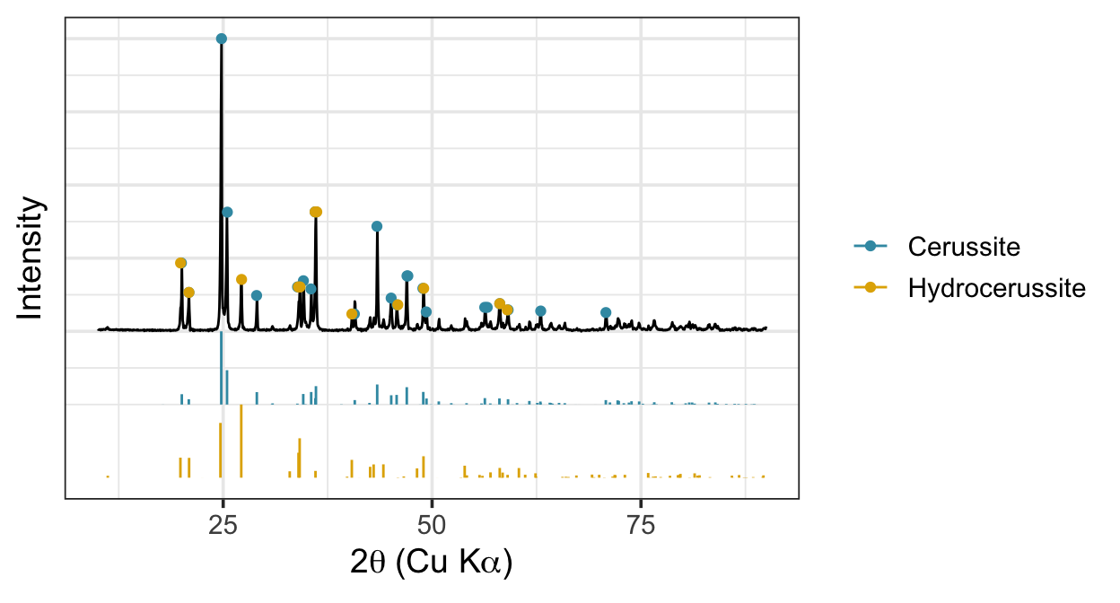
And there we have it—the XRD data with and the appropriate standard patterns, with each peak in the data labelled according to the corresponding peak in one of the standards. Of course, this is a relatively crystalline sample, and the signal-to-noise ratio is high; in a future post I’ll test this workflow out on some noisy XRD data.